
DHL Hungary
The original homepage was designed to serve both individual and business users from a single page. As a result, navigation felt unclear, key tasks were buried, and first-time visitors struggled to understand what DHL offers and why they should trust it.
TIMELINE
2 Weeks
PLATFORM
Website
ROLE
UX/UI Designer
WORK TYPE
Concept
Old design
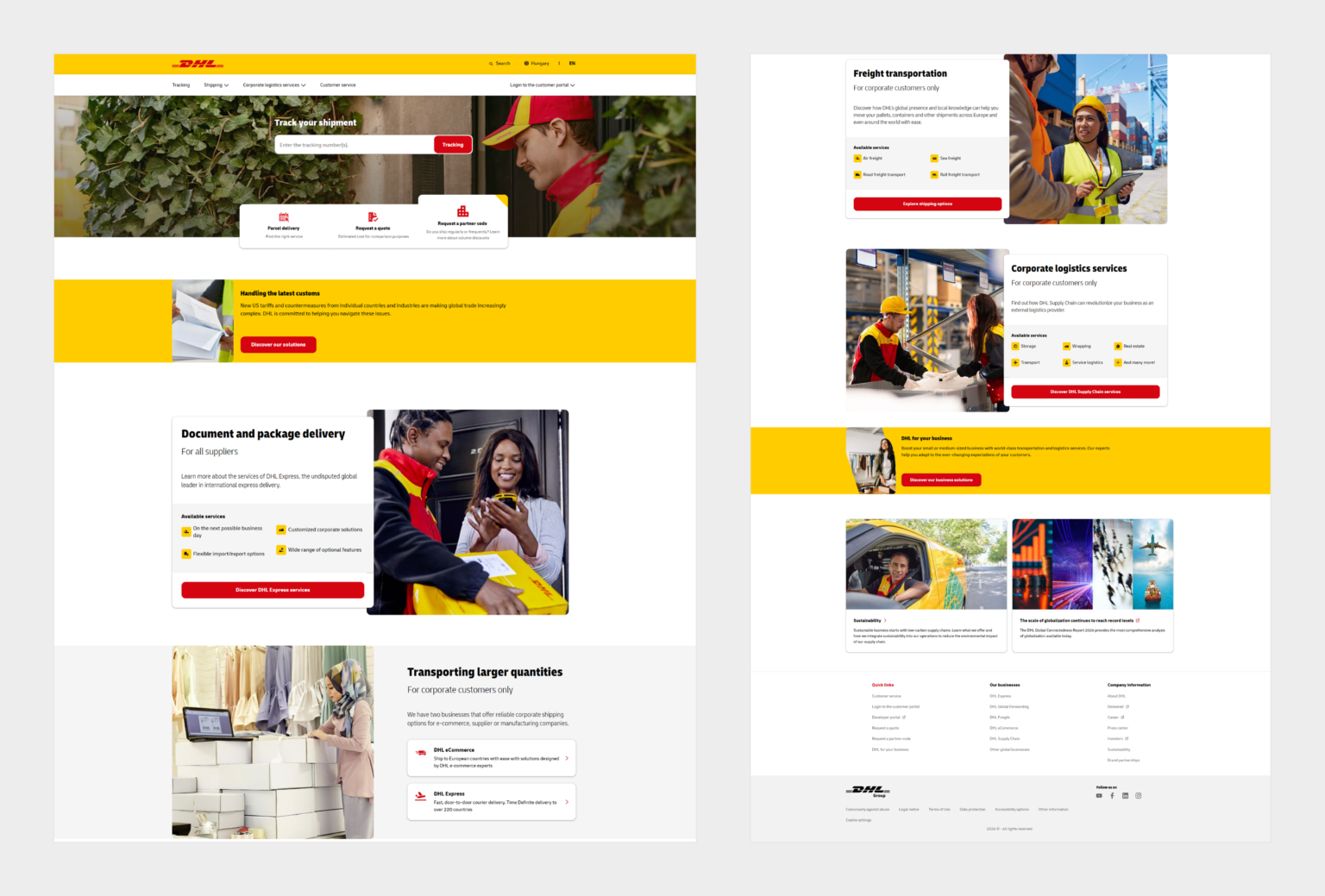
Upon analyzing the existing website, several issues stood out that worked against both the user experience and the page’s core jobs.
Redesign goals
The primary objective of the redesign was to address the identified issues, improve the page layout, and simplify the experience for users. Specific goals included:
- Lead with the brand promise while keeping the tracking task the most prominent thing in the hero.
- Separate the consumer flow from the business flow so each audience can find its path quickly.
- Rewrite every label and CTA into a clear, outcome-led promise.
- Turn the two stray banners into a clean top alert and a proper page section.
- Add a trust layer that gives a risk-averse shipper a reason to believe.
Problems
Primary task lacks priority: The tracking field sits in the hero, but a cluster of overlapping cards directly beneath it competes for the same attention. The single most common task does not visually win.
Copy describes features, not outcomes: Labels like “Find the right service” and “Estimated cost for comparison purposes” tell the user nothing about what they get or how long it takes. That raises the cost of a click instead of lowering it.
Two audiences are tangled: “For corporate customers only” appears repeatedly, which is jarring for a consumer who just wanted to send one box. The page never cleanly forks the consumer path from the business path.
No trust layer: No scale, no reliability signal, no reason to believe beyond the logo. For a service whose entire value is “your thing will arrive”, that is a missed job.
Two stray banners clutter the page: The customs notice and the “DHL for your business” strip both feel placed on the page rather than designed into it. They interrupt the flow and push the core services further down.
Designs
Here’s how I redesigned the experience to solve these problems.
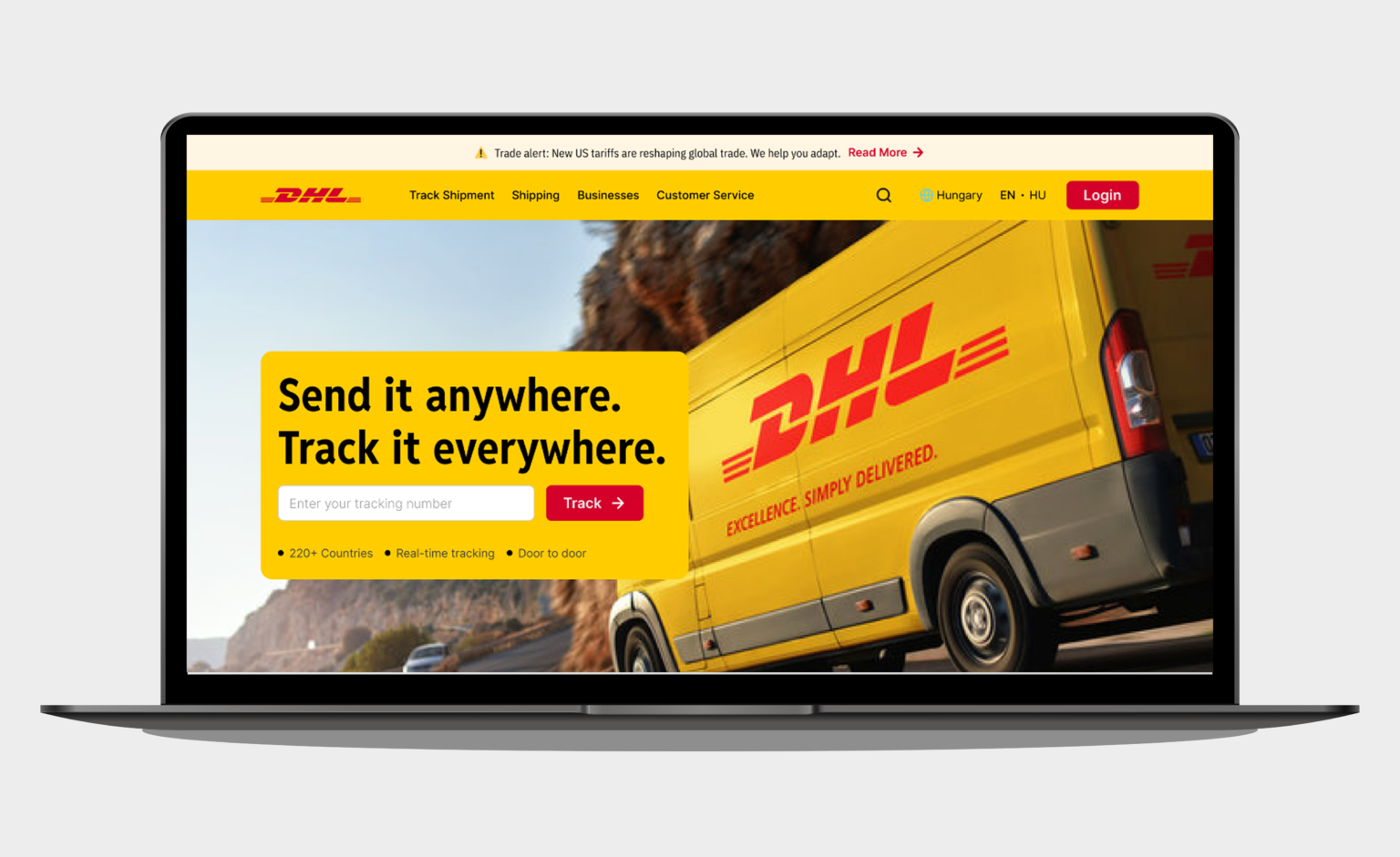
A hero that states the promise
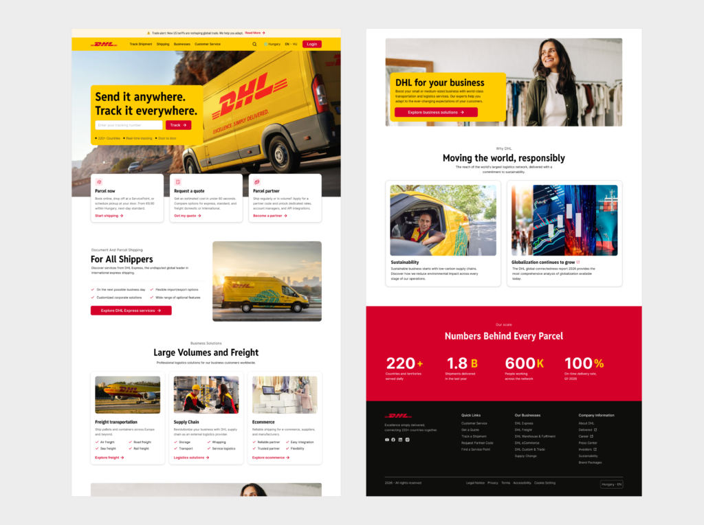
The original labelled a function against a low-energy photo of a courier in foliage. I led with the brand promise, “Send it anywhere. Track it everywhere.”, paired with a moving-vehicle image to signal speed and reach. The tracking input stays the most prominent interactive element, so the promise sets the tone but the task still wins the eye.
Rethinking the two stray banners
The original used two banners that felt disconnected from the page. I turned the customs notice into a slim alert bar for better visibility and rebuilt the business banner into a full-width section with a clear message and a single call to action.
A trust layer
I added a scale band so people and businesses viewing the page get a reason to believe. Concrete scale is exactly the proof a risk-averse shipper is looking for, and it costs nothing to read.
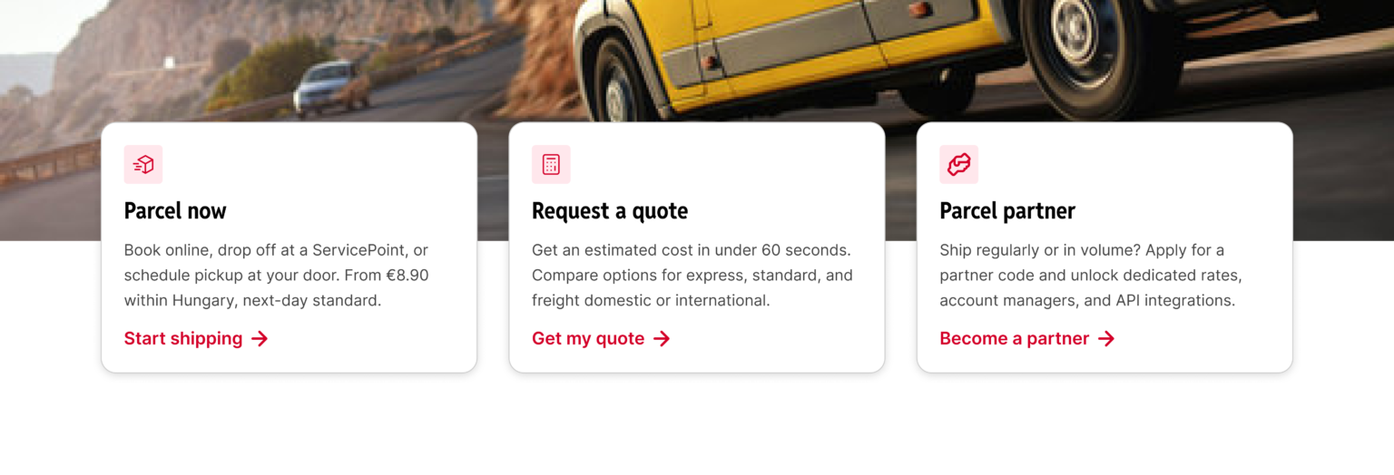
Action cards rewritten around outcomes
I rewrote each vague label into a concrete, benefit-led promise: a real starting price and next-day speed, a quote in under 60 seconds, and the actual benefits of the partner programme. This is the kind of change that moves real behaviour. People click when they can predict what happens next.
Outcome
Thanks for reading ⭐
The redesign focused on prioritisation rather than decoration. Instead of trying to show everything at once, the homepage was reorganised so users could find and complete their most common tasks faster. Secondary content was still available, just no longer competing for attention.
One design decision worth highlighting is that the full-width red stats section and the darker footer extend slightly beyond DHL’s usual visual style. I made this choice to give the page stronger visual hierarchy, reinforce trust, and create a more distinctive footer. Since the red still aligns with DHL’s brand, it remains consistent overall. In a real client project, this is the kind of decision I would review and validate with brand stakeholders before finalizing the design.
Have a project in mind? Let's talk.
I’m open to freelance projects and full-time roles.